
Let’s say you ran a survey, or a questionnaire, and you got a ton of open-ended responses from your audience. At some point, you realized that you can’t read them all manually. And even if you did, you’d probably be missing a lot of what they’re actually telling you. Or, maybe you’ve always been trying to read your survey responses, and just ignoring the majority of the open-ended comments in favor of a random sample of responses.
If you already started searching for solutions, you probably recognize that there is an inherent problem with your current approach to survey analysis. Manually reading responses is time-consuming and labor-intensive; sampling your responses makes it all too easy to miss critical insight from your audience; and relying solely on quantitative survey metrics leaves you with huge blind spots. What gives?
Automated survey analysis enables you to easily process the unstructured, open-ended text data you get from survey responses, shedding light on your blind spots and identifying patterns and trends that matter for your business. In this post, we’re focusing on the business applications of survey analysis for the voice of customer and voice of employee. Keep reading for our complete breakdown of survey response analysis and report building.
1. Types of survey questions
When we talk about survey questions, there are two major types that you should consider in your survey design: close-ended and open-ended.
- Close-ended questions: These types of questions have a predefined set of responses that your audience can choose from. Think of true or false, yes or no, or multiple choice questions. They are “closed” in the sense that it is not possible to input an unexpected response outside of what the survey provides. From a survey design perspective, there is little to “read between the lines” with these questions. However, they are great for survey respondents as they are generally low-effort and quick to complete.
- Open-ended questions: On the other hand, open-ended questions have no predefined responses and allow respondents to input whatever they want. Questions you’ve probably seen before like “How was your experience shopping with us?” or “Tell us if there’s anything we can do to improve” are bread-and-butter open-ended questions. The idea is to open the floor to your audience to get responses that you might not be able to predict. For example, a respondent might say “Your product arrived with missing parts” and you had no idea that this was happening. (And you’re probably not including a survey question that asks, “Did your product arrive with missing parts?”, ya know?) A methodology that includes open-ended questions gives you a level of organic insight you otherwise wouldn’t be able to get.
Similarly, another important distinction is between structured and unstructured data formats. Thinking ahead to the analysis of your survey responses, it comes in handy to know and recognize these data types.
- Structured data: This type of data is easily categorized because it has predefined responses. So as you can imagine, close-ended responses are a form of structured data because there is no possibility for variation in the data cells. Analysis of structured data is generally straightforward. Responses can be categorized with simple functions, cells can be counted, and so forth. Numerical data like NPS scores falls into this category.
- Unstructured data: In comparison to structured data, this type of data does not fit a predefined model of organization, like a table with rows and columns that has an expected set of values. Open-ended survey responses are unstructured text data. It’s important to consider how to analyze this kind of data because unlike structured data, you can’t just sort an Excel table. We’ll cover this in the coming sections. Anyway, here is a more in-depth post about unstructured data.
All this being said, what kind of questions and data formats should you use in your survey? Actually, rather than choose one over the other, you should incorporate a mix of both. With the right survey analysis methodology, you can bring together the relationship between quantitative data like NPS or CSAT scores with the qualitative insights you get from asking open-ended questions. Pair up an NPS question like “How likely are you to recommend the product you bought?” with an open-ended one like “What did you like or dislike about the product?” Responses to the second question will provide critical context as to why people gave a certain NPS score, so you can draw correlations between low or high scores with actual business elements, product features, and so forth.
Analyzing the responses to your survey questions will also be related to the different measurement scales. Close-ended questions are generally going to be nominal or ordinal scales (like NPS rankings), and open-ended questions will first need to be analyzed, and quantitative insights drawn out of them, before being measured properly. This two-step process is what makes qualitative analysis a bit challenging, but don’t worry, we’re going to get into it in a second!
2. Survey design considerations
Okay, so we’ve been over the general types of questions you can ask and data formats you collect in a survey. Which maybe you already knew, but it helps to cover it anyway. Now, of course, you have to actually plan and send your survey. What we want to get across in this section is that you should think ahead to how you’re going to analyze the survey first, as this will help you design a really great survey.
What’s great about having some automation in your survey analysis is that it actually enables you to think bigger in your survey design. Knowing that you have to analyze responses manually can limit what kinds of questions you might ask and the types of responses you opt to collect. It can easily lead to a quantitative-focused survey that misses insights coming directly from your audience. I mean, come on, we’d all shy away from asking open-ended questions if it meant we’d have to comb through all 1000 responses on our own.
As you design your survey, anyway, you should think about your overall objectives and your use case. Customer satisfaction? Employee engagement? A good exercise to begin with is to write down questions you have and want to answer. Keep an open mind because the responses you get could challenge your assumptions, and you have to remember to listen to the data. Here are just a few points to go over as you get into the nitty gritty of developing and wording your survey questions:
- Interrogate your questions: For each question, think about what kind of data format it returns and if it’s aligned with your objectives. Let’s say you want to learn about customer experiences at your store. You could ask, “Did you have a good experience at our store? Yes/No” but a more insightful question might be “Tell us about your experience at our store” as an open-ended text field. Whereas one question returns a nominal, structured value, the other returns unstructured data that contains richer insights. However, also make sure that you’re using the right type of question. If you use “Did you have a good experience at our store?” as an open-ended question, the responses are probably not going to be as great, because people might just write “Yes” or “No” without much explanation.
- Avoid biasing respondents: For an open-ended question, you should consider how a respondent might answer (or be biased to answer in a certain way) based on how it’s worded. The idea is to “stress test” your survey questions to avoid biasing the answers you get. Examples of bad survey questions are leading questions like “Did our food give you a stomachache?” Sure, you might get some answers, but if your objective is to get unexpected feedback from customers, it’s too narrow and not giving space for people to highlight what they feel is important, by adding details and context. How can you know about an issue without asking about it? You have to let your audience mention what is important to them.
- Consider sample size: Sample size is the number of respondents in your survey. You want to send your survey to enough people, and get enough responses back, to have a good amount of data that represents a broad spectrum of your audience. General advice is that you should have at least 100 respondents in order for the results to be statistically significant. When you have an automated survey analysis tool, too, you can increase your sample size without worrying about what to do about the analysis of responses.
- Cross tabulating segments: When you design a survey, you should consider the segments of your audience you might want to look at in more depth like age, gender, and location. For instance, you might find an important pattern between age and location in your data. Then, you can also pull in the open-ended responses from these segments and better understand what’s going on in your audience. All of this information is called metadata, and it plays a big role in analysis and reporting, which we’ll cover in later sections.
- Plan your analysis methodology: This one is kind of a no-brainer given the subject of this post, but hey, it bears mentioning regardless. Thinking ahead is the core concept that we’re trying to convey here. Before you build and send a survey (which takes time and effort!) and get responses from your audience (time and effort that they’re giving to you), you want to be sure that it’s going to provide the right insights.
The TLDR of good survey design is that it always depends. It’s a delicate balance of understanding your business, knowing what you want out of your survey, and crafting the right questions to give you actionable insights about your audience. As long as you’re informed and thinking ahead, you’re setting yourself up for success in the next step of the survey process: analysis!
3. How to analyze a survey
The first question is, what do you want to analyze? There’s a lot to consider. Since we’re focusing on open-ended surveys in this post, we won’t dive into quantitative analysis methods. You’re here to learn about what to do about all that text data!
When it comes to analyzing open-ended questionnaires, the first step is coding. Coding a survey is just the term we use for organizing text responses into categories for ease of analysis. You see, the two-step process of qualitative data analysis that we mentioned earlier ultimately results in being able to conduct quantitative analysis on that data. Coding translates unstructured data into structured data. By sorting similar responses into buckets, you can more accurately detect patterns and see trends. Now, there are two ways you can go about coding:
- Manual coding: As the name implies, manual coding is done by a person who is responsible for reading responses and categorizing them correctly. There is variation even within this, for example oftentimes the person relies on a codebook of predefined categories that the business uses for analysis. Manual coding is precise but time-consuming. Also, whenever a person is involved, there is a chance for bias to impact the results of the analysis. For small-scale surveys, manual coding is not a bad idea. However, it’s inflexible if you ever want to scale the size of your survey.
- Automated analysis: Automating survey analysis is usually achieved with text analysis solutions that use machine learning and natural language processing techniques to process large volumes of unstructured text data. The long-term advantage of automated coding is that it’s scalable. Because AI is in the mix, these solutions are strong enough to handle a lot of data, and new data at that. Many of the disadvantages of manual coding are solved by automated analysis. For instance, let’s say you send a weekly survey with the same questions every time. With manual coding, each person doing the analysis will have a different bias, and the organization of data won’t be consistent. Automated analysing in this sense enables you to keep analyzing new data with the same, consistent framework that returns accurate results and is reliable over long periods of time.
The added benefits of automated survey analysis is the visualization of data. Good survey analysis platforms allow you to view insights and build dashboards in a seamless fashion. With manual analysis, you’ll spend a great deal of time fussing with the data, exporting it, and building visualizations that you just might be happier to automate.
Case study: BRP turns 10 years of surveys into insights with Keatext
Bombardier Recreational Products (BRP) is a global leader in powersports vehicles that has built a name for itself crafting beloved products like the Ski-Doo and Sea-Doo. With a wealth of meaningful open-ended survey responses but no clear way of turning it into insight, they turned to Keatext to automate their survey analysis.
- The situation: The team at BRP was building their voice of customer program from the ground up – that meant 10 years worth of surveys largely unanalyzed
- The problem: With survey feedback mostly siloed at the organization, the team needed a way to not only consolidate insights but implement a solution seamlessly
- The solution: Keatext’s advanced text analysis was able to provide rich insights from BRP’s qualitative survey responses and create a consistent framework for analysis
- The impact: Decision makers came together to lead organizational changes at BRP that put the customer at the center of their work, which was now possible thanks to Keatext
BRP’s global customer advocate, Myshka Sansoin, says: “The biggest improvement Keatext brought to us is facilitating or even participating in our culture change. BRP wants the customer to be at the center of everything it does. Having an easy way to understand and share what the customer wants helps us accomplish this.”
Read the full case study here.
4. Visualizing survey results
Visualizing data and insights from your survey is a key element of your own exploration of insights as well as, ultimately, what you present in your survey report. Let’s take a look at some of the common visualization strategies that you can use or might come across.
- Word clouds: These visualizations are generally used to capture your interest and bring forward the biggest topics identified in your data. Word clouds rank word frequency by size to create an easily understandable image. However, word clouds lack most of the context, sentiment, or “why” behind the word frequencies that you see. They simply can’t present any meaningful relationship between topics and opinions, let alone any metadata in your survey. So while word clouds are easy (and admittedly, a bit fun) to create, they come with a lot of blind spots, especially for those of us looking for a deeper level of insights.
- Excel: Using a spreadsheet tool is great for structured data with predefined responses. It’s possible to fanagle around with Excel to infuse some element of automation and code your data, and build visualizations from this, but ultimately this is not a sustainable approach. Again, for small-scale surveys you could get away with it, but the limitations are clear, and in the business context, you won’t get too far with this method.
- Tableau: Dashboarding tools like Tableau allow you to build visualizations from your data. The level of customization and accuracy here is much greater than word clouds or Excel charts. Think of it as a more powerful Excel visualization. However, it relies on the analysis already being done and identifying topics and opinions in your survey responses – something that is more efficiently achieved with a text analytics solution.
- Text analytics dashboards: Most text analytics platforms today offer dashboarding functionality to visualize results of the survey analysis like sentiment categorization, topic detection, category grouping, and so forth. The advantage of a text analysis dashboard as opposed to one through Tableau, say, is that it is fully integrated with the data analysis. Whereas in the latter you have to export insights and reupload into a system unfamiliar with your data categories, with an integrate dashboards you would have everything at your fingertips that you need to build strong visualizations.
The strength of your survey result visualizations comes down to the analysis of open-ended responses: topic detection, keyword extraction, sentiment analysis, and all that, and the metadata you have in your survey responses: demographic information like age, gender, location, and so on. This information acts as a layer on top of the core text analytics engine in order to enrich visualizations.
Dashboards are probably your best bet for presenting your survey results in the most comprehensive way. You can add multiple charts, apply metadata filters, segment groups, and pull in as much context as you need to get to the bottom of what’s happening in your survey data. Let’s take a look at some visualizations you will see on most text analysis dashboards. Images are from Keatext dashboards!
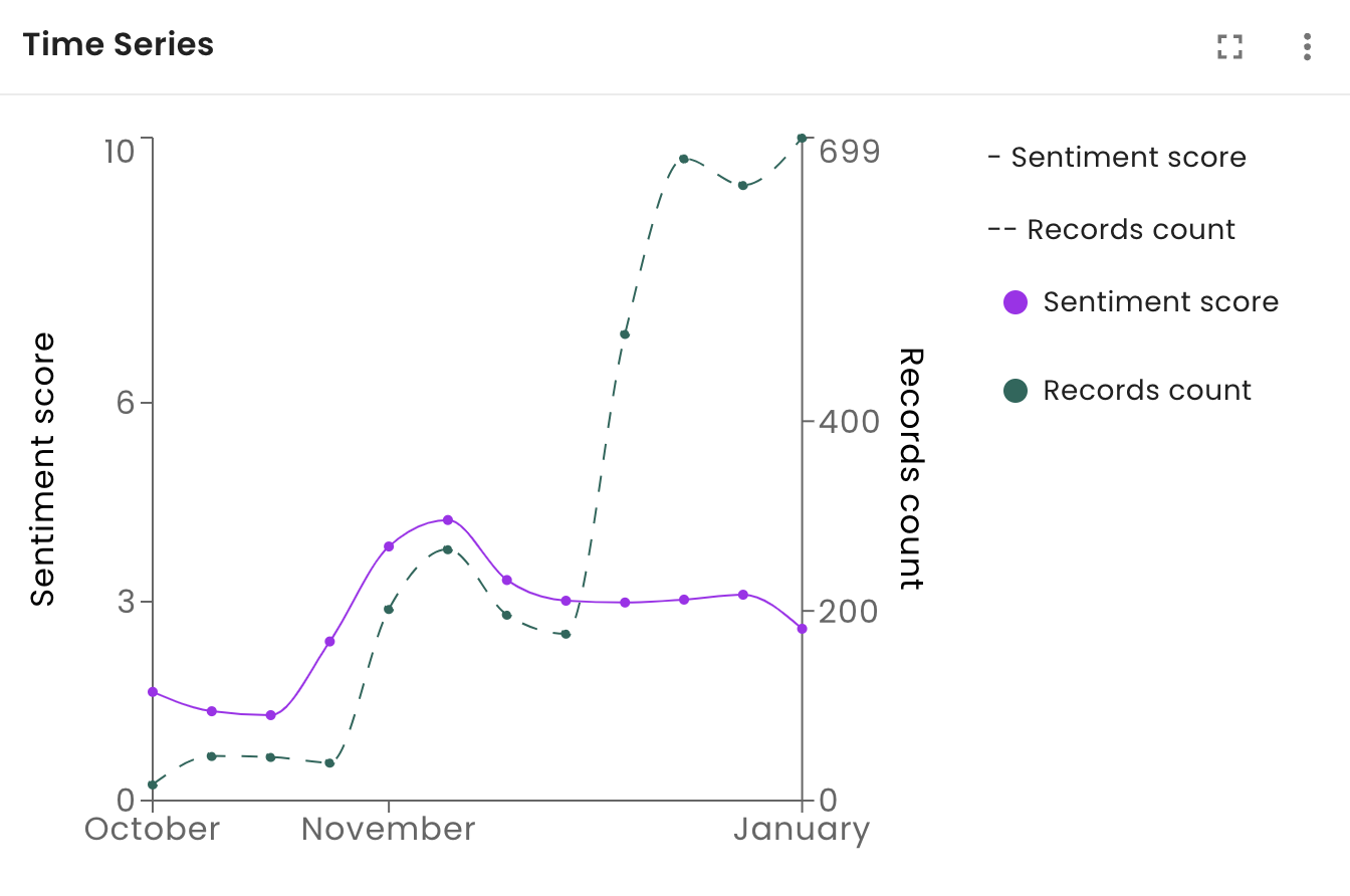
Line graph: A line graph is best used to track changes over periods of time. In the example below, you can see the relation between two lines: number of records (i.e. comments from customers) and the overall sentiment score (i.e. how positive or negative those comments are). You can see that in November there was an increase in positive sentiment.
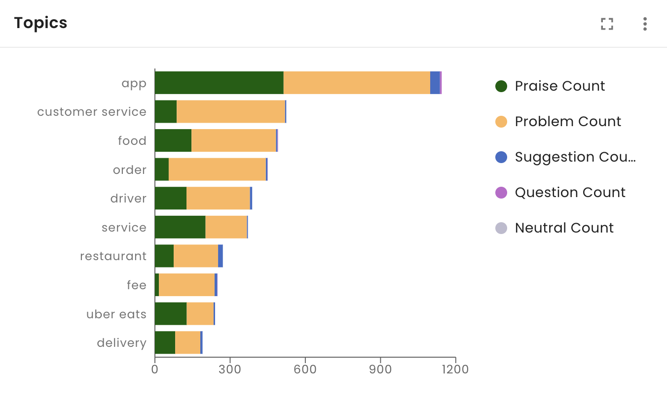
Bar graph: A bar graph is best used to compare things between different groups of metadata. A best practice is to use a bar graph with more than 3 or 4, but less than 12 data groups. In the example below we can see the most frequent topics identified in the survey broken down by the sentiment of the associated opinions.
Pie chart: A pie chart is best used when you’re trying to compare parts of a whole and see the relative percentages. You should use a pie chart with up to 5 groups but beyond this we recommend using a bar graph. For surveys, this visualization is an excellent way to show a breakdown of NPS or sentiment scores. The summary value in the center is the calculated average.
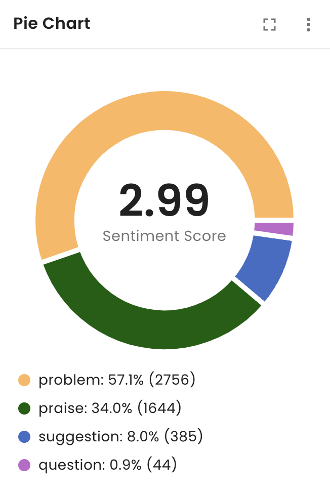
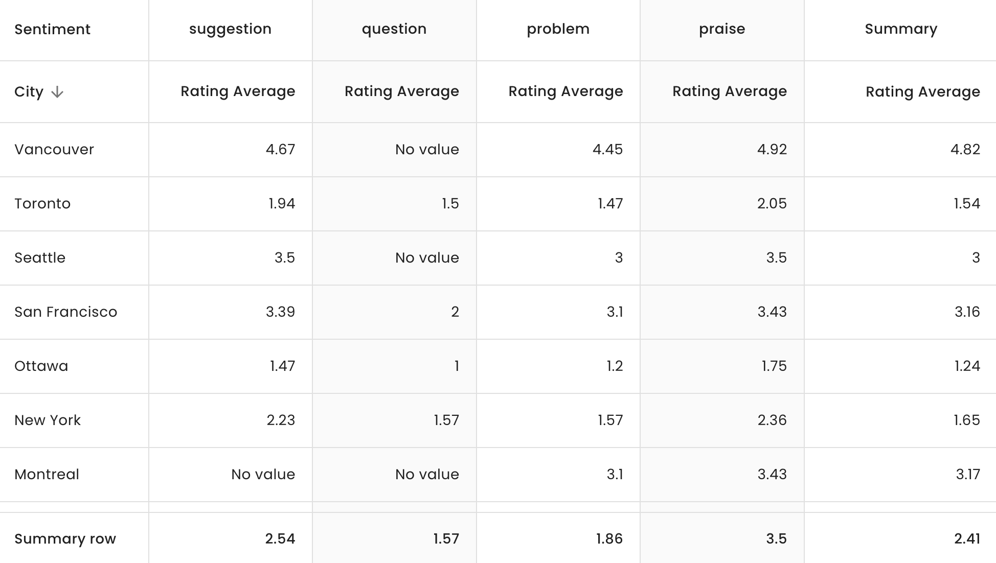
Table: You should use a table when you want to plot a lot of data, generally if you have more than 12 groups you want to visualize together. A simple table plots rows and columns while a pivot table allows you to “pivot” over time or any other variable. Tables are good for showing the whole picture, and the advantage is that they are very sortable.
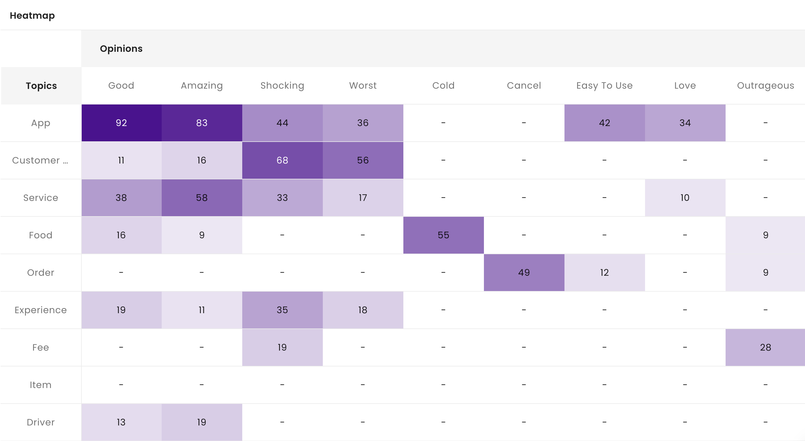
Heatmap: A heatmap shows the intersection of different data groups. In our example, it is an excellent way to understand long-form text questions, by showing the interaction between topics and opinions. We can easily identify the areas that have the most frequency and determine if there are any problems – such as “shocking customer service”.
5. Preparing a survey findings report
Analyzing a survey for your own internal purposes is one thing, but especially in the business context you will eventually want to show what you have discovered with other members of your team or upper management. This section walks you through what makes a good survey results report and how automated survey analysis solutions can support your workflow in this area.
What goes into a survey report? In general, you’re going to present a series of insights that you identified as valuable for your business along with some written explanation, context, and recommendations. Depending on who you’re presenting to, you could include the raw numbers from your survey like how many respondents there were, the results of close-ended responses, average NPS or CSAT score, and so forth. It’s really up to you, but these are the essential components.
The survey results report is essentially the outcome of all your work thus far to analyze the survey data and explore insights. In many cases, this report is how you communicate directly with decision makers about how to improve customer or employee experiences. Here’s what can go into your report:
- Visualizations: Based on the objective of your report, and the audience, you should build out the most appropriate visualizations that dive into the big insights and support your main talking points. As we saw in the previous section, you can choose the right visualization for what you are trying to convey. The more you do this, the more intuitively you will understand how each visualization can contribute to your survey results report.
- Interpretation and context: You have to do a little “fine tuning” to get your report just right. Good reports have some level of interpretation and context rather than only a collection of visualizations. Every visual should have some text that explains what we are seeing and what to make of it. Your interpretation of the results is likely what your audience is looking to hear!
- Recommendations: Depending on your role, you might be responsible for providing some guidance and recommendations as to what to prioritize in the business. Strong text analytics platforms like Keatext are now able to provide recommendations for elements or topics that have the greatest impact on metrics like your NPS score, for instance. Just like your interpretation of survey results, your recommendations can hold a lot of weight in your survey analysis report.
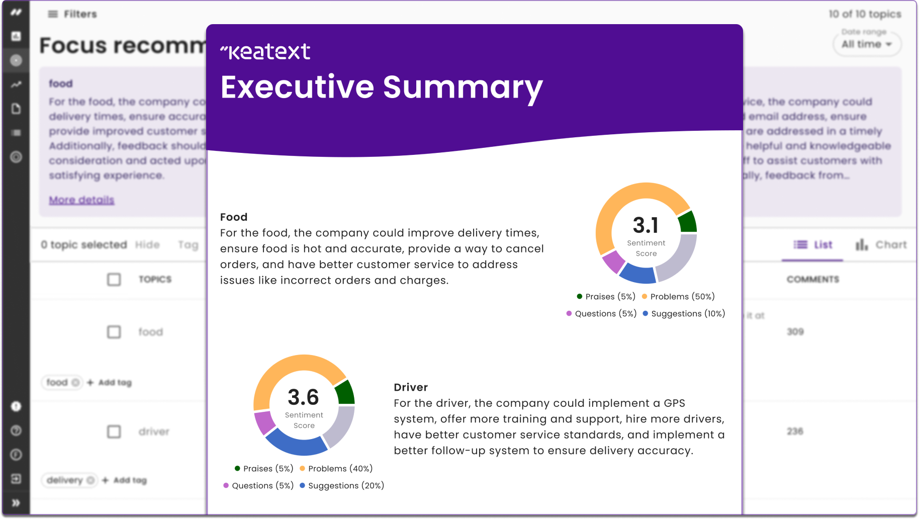
The advantage of using a text analytics dashboard to visualize your insights for your own purposes is that you can use those same visualizations in your survey analysis report, seamlessly. Platforms like Keatext allow you to export dashboards or share a public link so other stakeholders can see it. Keatext even automates reporting for you, providing an executive summary you can download that highlights your top opportunities to improve, along with actionable recommendations on how to start making changes, generated in natural language.
Choose Keatext as your survey analysis and reporting solution
At Keatext, we’ve built a strong platform for the analysis of open-ended text data like survey responses, and we’re constantly iterating on it to improve its usefulness in all elements of your everyday work. Here’s what makes our platform ideal for survey analysis:
- AI-driven text analytics: A survey analysis platform is only as good as the quality of insights it can uncover for your business. Our core text analytics engine is strong enough to learn and adapt to the unique context of your data.
- Automated, ready-to-share reports: Keatext consolidates your top opportunities for improvement identified from your survey responses in one easy PDF. You can instantly export a summary of these insights to share directly with the right decision makers.
- Recommendations: Thanks to one intelligent integration, we built a way to use Keatext as a knowledge base for OpenAI’s GPT to generate natural language recommendations on how to improve areas of your business that have the most impact on your NPS, CSAT, or CES scores.
- Dashboard visualizations: Customize your dashboards with flexible widgets like a pie chart, sentiment score, heatmap, time series, and more. (Remember the visualizations we went over earlier? We’ve got them all!)
- Integrations: Keatext integrates with survey platforms like Surveymonkey for a fully centralized analysis experience. Data can be pulled in real-time so you never miss critical insights from your survey responses.
As we have seen together, there is a lot that goes into survey design, analysis, visualization, and reporting. We hope that this post has shed some light on these important elements and made you more informed and confident about managing surveys at your business. Thanks for considering Keatext in your search for a survey analysis solution. Good luck with your next survey analysis project!